
 Digital. Digital. Digital.
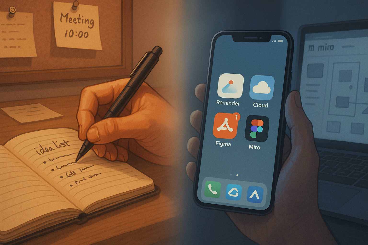
We rely heavily on digital media in most aspects of modern life, particularly within the tech industry. Our phones are our go-to, even for the most basic reminders. Writing quick notes on our palms and using pocket diaries for ideas is a thing of the past.
Digital tools and cloud storage have replaced pen and paper due to their flexibility and convenience. Our reliance on computers is now normal, and for the most part, that’s fine.
But something happened last Wednesday that reminded me:
In UX, the medium is not the message. Sometimes, the simplest tools draw out the deepest truths.
Digital Design: The New Standard
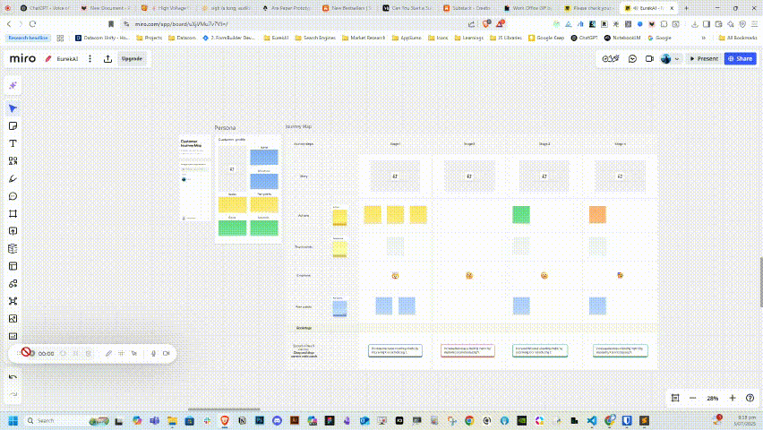
Miro, Clickup, Figma, and many white boarding apps are now integral to our design process. Flow ideation, interface sketching, and journey mapping all happen on screens, not sketchbooks.
This change isn’t a mistake. To be frank, it’s quite reasonable. Digital collaboration is a boon because of distributed teams, rapid prioritization, and instantaneous feedback.My method is consistent — it’s efficient, polished, and globally standard.
Surprisingly, last Wednesday highlighted the advantages of pen and paper’s imperfections over digital pixels.
The Issue: Oversimplification’s Pitfalls
We’re developing an email template builder as a complementary tool for our platform.
The goal: a lean B2B product, scaled via Lean Product Development.
SIMPLICITY was our shared goal from day one. But here’s the catch — when you obsess too much over the idea of simplicity, you sometimes end up over-simplifying things. It becomes a trap. Subconsciously, you strip away essentials in the name of ease. And that’s exactly what happened.
We ran early user interviews. Took notes. Synthesized insights.
Based on their feedback, we built two interactive Lo-Fi wireframes for A/B testing. Our plan was to finish discovery by week’s end and present our findings to stakeholders the following week.
So we got to work — shoulder to shoulder, heads down. We designed two versions. Feedback loops closed. Confidence is high. Ready to roll.
Only… we weren’t ready for what happened next.
The Setup: Real Users, Real Observations
We invited five people from our client services team — all of whom had participated in our original user interviews — to a moderated in-person Usability Testing Workshop.
We prepped everything:
-
Two interactive wireframes (Option A and B)
-
A quiet observation room
-
A recording setup (with consent)
-
A note-taker on the side
Minimal interference from our side, except soft nudges if they got stuck
Let’s break it down:
Wireframe A: Clean, minimal, drag-and-drop blocks.
Wireframe B: Guided onboarding with tooltips and cues.
We were sure Option B would shine. After all, it was based on their own feedback from the interviews. But the moment our first participant began her journey, our confidence wobbled.
Reality Hits Hard: Participant 1

She struggled. Really struggled.
Do I need to create a brand first?”“Where do I upload my brand logo?
Questions kept coming.
She clicked the help button multiple times. Not once did she complete the flow without friction.
In our closing conversation, we asked:
What four things did you find missing that prevented you from completing your task?
Her reply stayed with me:
The help button is there — and that’s good — but how can you help me not click it so often?
That struck deep. Help should be a safety net, not a crutch. In UX, a feature that gets used too often might be a symptom, not a solution.
Secong Test, Second Shock
Still hopeful, we continued with the next participant.
Unlike our first participant, we received varied feedback this time.
- ✅ 40% of the experience was smooth.
- ❌ 60% caused confusion. Interestingly, most of his positive points aligned with participant one’s frustrations.
When asked how many emails he would send using this tool daily:
Honestly, we’d struggle at first. But we’d learn. That’s how habits form, right?
How will this affect new team members?
Steep learning curve for them. But they’ll eventually adapt.
That failed to reassure me. In fact, it exposed a deeper concern — adoption friction.

When Interviews and Real Interactions Don’t Match
Here’s the twist…
All five participants had been part of our initial user interview cohort.
The feedback from these users on their software’s shortcomings and their expectations for improvement directly informed the conceptualization of our Option B design.
Now, using the real interface, they’re encountering problems, saying, “It’s not functioning.”
And this a well-known truth in UX:
People often say one thing in inetrviews.. But they do something very different when interacting with real product.
Why?
Real-world application often transforms stated facts into opinions, since our speech reflects thoughts and imaginations molded by prior experiences.
Sometimes, we can not properly convey our imagination. However, interacting with a physical object instantly activates our decision-making processes, diverging from our conscious thoughts.
I’ve studied this extensively in books, white-papers, case-studies, but last Wednesday, I witnessed it firsthand.
No Time. No Solution. What Now?
With feedback from two users and three more waiting, we were under pressure. There wasn’t enough time to rework the third wireframe digitally.
That’s when a teammate said:
What if we sketch it on paper instead?
I had a sudden ⚡flash of insight. While paper prototyping is traditional, its effectiveness is well-established. A considerable amount of FAANG companies employ this.
We gathered around, scribbled based on recent insights, scrapped and restarted sheets, and landed on a single paper prototype.
One sketch. One flow. Built from real frustration.
Based on what we just learned.
The Magic of Paper: What Happened Next
We briefed our next participants on the new format.Unexpectedly, they showed excitement. Actually, they went along with it.
They tapped on drawn buttons
Pretended to scroll
Made sound effects mimicking clicks and key presses
It transformed into a lively, engaging, and humorous experience.

And what was the outcome?
- ✅ 70% of the positive feedback was consistent across all three.
- ✅ Clarity increased
- ✅ Completion rate jumped
- ✅ Comments were sharper and clearer
This flow makes sense. Oh! So this is where I’d pick a template! Wait — can I go back here? Outstanding!
One user even air-clicked a button and smiled. That said it all.
The user pointed their finger at the sketched button on the paper prototype and mimed a click gesture — as if interacting with a real interface.
Paper vs. Digital: Who Wins?
The last participant we tested experienced both:
- Paper Sketch ✅
- Option B digital version ❌
Paper won. Unequivocally.
🔁 What Changed?
Our obsession with pixel-perfect fidelity ended.Instead, our attention turned to:
- 💡 Intent
- 🔍 Clarity
- 👀 Behavioral cues
We asked the right questions at the right time:
- “What are you trying to do here?”
- “Where do you feel stuck?”
- “What would you expect next?”
The answers came not just in words — but in gestures, pauses, hesitations, and even sighs.
📈 Business ROI (Yes, It Matters)
This one-day paper prototype test:
- ✅ Validated a new onboarding flow in < 24 hours
- ✅ We offered practical advice, not just general ideas.
- ✅ Saved 10+ design hours.
- ✅ Helped us launch a working flow.
Just imagine — 10 sheets of paper beating out costly software and tools.
💬 Final Reflection: Why Paper Still Matters in UX Research
💬 Final Reflection: Why Paper Still Matters in UX Research
I started this journey thinking digital was the only way.Wednesday proved otherwise.
Paper prototypes are not outdated.
They are:
- Fast
- Insightful
- Collaborative
- Engaging
They are:
- Fast
- Insightful
- Collaborative
- Engaging
Sometimes, clarity lives in simplicity. Not in software.
And in moments when the team is stuck, time is short, and answers are fuzzy — don’t design more. ✏️ Sketch. Don’t stress..
Often, the sharpest product insights come not from pixels — …but from markers, paper, and a curious question asked at the right time.
💡 Why Paper Works (Cognitive Science Meets UX)
This wasn’t just a coincidence or happy accident.
UX research and cognitive psychology — including Don Norman’s The Design of Everyday Things — support what we experienced:
-
Low-fidelity designs reduce cognitive load Users focus on task flow and purpose, not aesthetics or UI affordances.
-
Sketches invite critique Their roughness signals that feedback is welcome — unlike polished mockups, which often feel “final.”
-
Tactile interaction triggers embodied cognition When users physically point, tap, or mimic interactions, they engage deeper brain pathways — leading to more genuine, intuitive feedback.
When users air-click a button on paper and smile — that’s not just engagement. It’s cognitive alignment. They’re processing, not just performing.
📚 You Might Find These External Resources Helpful
(…or perhaps you’ve already explored them)
To complement the story and insights shared above, here are some excellent reads that dive deeper into the psychology and practice of paper prototyping in UX research:
- Paper Protyping — by Nielsen Norman Group. A foundational article that outlines the advantages, methods, and use cases of paper prototyping from one of the most respected UX research authorities.
- Getting the Right Design and the Design Right — Microsoft Research A research paper that shows how low-fidelity prototyping leads to better exploration and design outcomes by reducing commitment to initial ideas.
- 5 Benefits of Paper Prototype Testing for UX Design — Insight7 A quick and practical overview of why paper testing still holds relevance in today’s fast-paced digital product cycles.